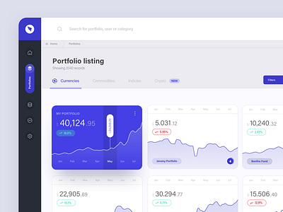
Portfolio Expo dashboard


Hi Dribbbblers,
today I wanna share a project called Portfolio Expo. A platform for small investors to share their long-term portfolios.
Quick design tip #4: How to use colors in UI
1️⃣Limit the number of colors. Use a neutral color for primary color (around 50-70%). Secondary should be contrasty to the primary. You can use this tool to test the contrast: https://webaim.org/resources/contrastchecker/
2️⃣Use darker and lighter variations on a particular color scheme. For darker tones lower brightness and add saturation. For lighter tones add brightness and lower saturation.
3️⃣Use color psychology. Each color indicates a different meaning. Look at your personas and decide which color is suitable for the end-user.
4️⃣Shadow's colors are influenced by the light source. So they are never solely black but they are cast by a key light and ambient light.
🖤And don't forget to show me some love with "L" key. Thanks!
—
👨🏻💻 Make sure to follow me on other social networks as well:


