


Mobile First

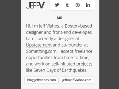
Working with a full 960px palette, I had been struggling to lay down confident content and visuals for a new, simpler website. Through some recent experience at Upstatement, and from reading Luke Wroblewski's "Mobile First", I've come to fully realize (I tended to ignore it for while.. shame on me) that designing mobile-first can help tremendously in narrowing down goals, focus, and content. So here we are at the top of the page at 320px, and I am feeling relieved that this might be a good starting point.
(It also made me think of a nifty idea to make my logo adjust at small sizes -- mobile version JEFF/V -- tablet+ version JEFF/VLAHOS)
Thoughts and feedback appreciated!


