Monti Luger - Branding: Logo - Detail

Hi everyone! 👋
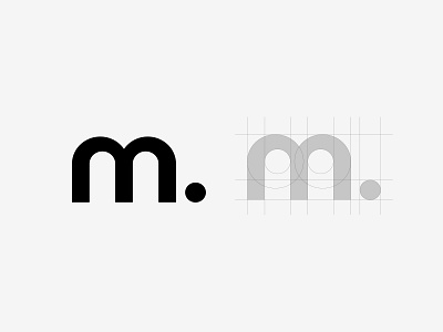
In this detail shot you can see how we constructed the distinct "m." We wanted something kinda playful, round, but still geometrical. We made sure not to make it pointy, since that would have been to aggressive and wouldn't fit my clients personality. The dot at the end has three purposes: First of all to give the m some direction, wrap it up, and also indicate that it's an abbreviation of something. Make sure to check out the other shot about the logo, so you know what i excactly mean by that!
Project Objective: I'm currently building a complete personal brand for a photographer. That includes a logo, stationary, business cards and a website.
____________________________________________________
Hit that 'L' if you like what you see 😊 Comments and critique is always welcome as well! 🗨️
I am also available for freelance work! 💻 Learn more about me here: https://dominiktampe.de/
If you'd like to collaborate or just have a chat, feel free to message me!


