STL MLS Logo

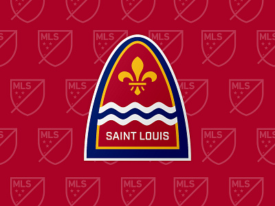
MLS just announced that St. Louis will be the next expansion team. This is my proposed Crest for the team.
I really wanted it to feel like St. Louis, so it uses elements and colors from the St Louis flag. The main shape of the crest is the shape of the St. Louis Arch. I wanted it to be different from other crests, especially in MLS. Using the shape of the arch gives it the feel of a classic soccer "shield", but flipped upsidedown.
As soon as it was announced, I knew that I had to play with an idea, and I'm super happy with where it landed. I'd love it if the new team actually used it.


