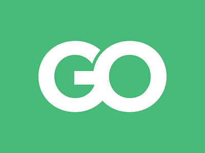
ProjectGo Logo Design
Designed a logo for a client building a startup which offers advice on the business side of the hair industry.
Only client requirements were for the logo to be written as "ProjectGO."
I created a monogram out of the letters G and O to resemble the shape of an infinity icon for the idea of "continuous forward movement." The soft green colour was used to resemble positivity, energy and reiterate the concept of "forward movement." I set my type using a clean and simple sans serif in Helvetica.
View all tags
Posted on
Sep 8, 2019
More by Kyle Dekker View profile
Like


