Tie dye cloth logo

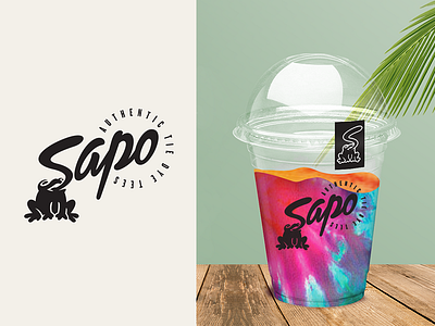
Concept = S + 🐸
Sapo is an entrepreneurial idea of hand-dyed t-shirts, its name means Toad. The aim of the design was to communicate a young, fresh, authentic brand, ideal to dress on the beach. It was decided to design a dynamic and youthful character that could be used separately on clothing labels. The black color was chosen because the clothes are very colorful so the symbol of Sapo would stand out.


