


"C" & "H" Ligature

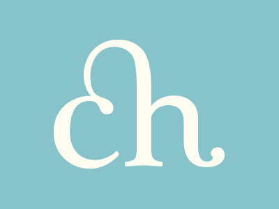
I've been fiddling around with the idea of a logotype for a while but felt that the initials of my name, double "C", wasn't too interesting to work with. So I opted for the recurrent "C" and "H". I personally like ligatures, but not sure if it would appear overused/underdeveloped as a logo? Any feedback is greatly appreciated!


