


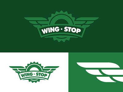
Wingstop Rebrand


I know what you're thinking: "Here we go, another unsolicited rebrand #eyeroll". You're not wrong. I sort of eye-rolled myself when I thought about putting this out there.
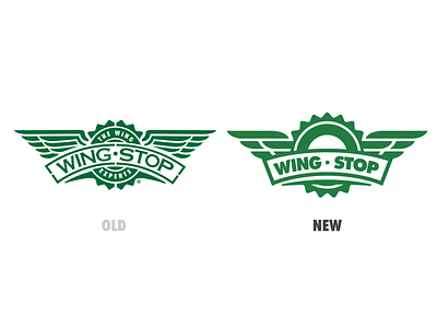
But then I realized this concept has been bouncing around my head for, oh I don't know, at least a few years now across the thousands of times I've eaten at Wingstop. For as much I love their wings, I can never get past the fact that their current logo seems so stuck in the 90's.
There's definitely some things that could be better about this concept, including and most notably the type (any type designers out there interested in riffing on this?), but this was done over a few days, from a place of pure love for all things wings. 🍗❤️
The reality is that I'm going to eat their wings regardless of what their logo looks like, but man, this would certainly make those meals a whole lot better.


