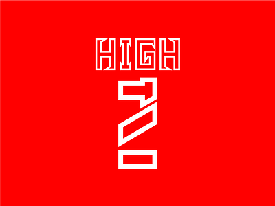
Too high energy drink logo
Energy drink logo named 'too high' ...
The lower part is a combination of words 'too' and number '2' ... Vertically it looks like number 2 which means a double dose of energy, activeness ...
Horizontally it made the word 'too' which stands for too much excitement and height of energy ...
Overall it is making 'T' which is relevant ...
Share your thoughts if you like it ...
active
beverages
brand identity
branding
concept
creative
digital art
energetic
energy drink
flat
graphic design
high
learning
logo
minimal
red
simple
student
too
white
View all tags
Posted on
Oct 10, 2019
More by Mutahhara Fakhruddin View profile
Like


