BFC&T Old-world Crest

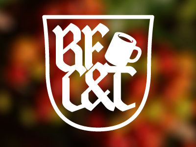
Client/friend wanted something less like a logo; wanted something that seemed more like a special club. Something the BFC&T regulars would like and feel a part of. So I finished this late last night. I think it'll need a couple more iterations.
Not sure about the termination of the stroke on the 'F' where it meets the ampersand. That whole area feels like it's "tight but not touching."