Haan - Brand Identity

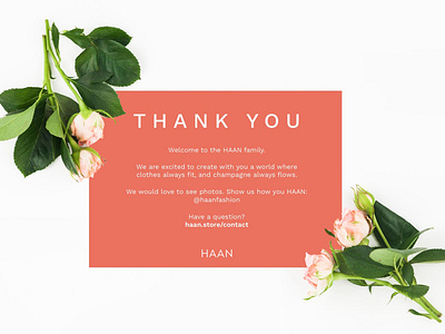
We spent a decent amount of time looking for the right fonts that fit the brief and transmitted Haan’s message. We ended up using a font that was simple but had some edginess and brought great results. The logo turned out very minimal but it stood out with strong and classic typography which made it simply modern. To find out more please visit www.9inchideas.com


