Fitness Icons

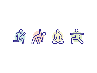
I find stick figure type icons in an outline style to be challenging. Single lines for limbs look wispy unless you use a super thick stroke. And double/outline strokes can make arms and legs look too chunky, or if they are close together, the negative space inside them becomes too small.
Anyway, I spent way more time on these guys than I usually do, but I'm really happy how they came out!
Want to get notified when I release new sets, and get discounts too? 👉 sign up here


