GE3 Brand Book

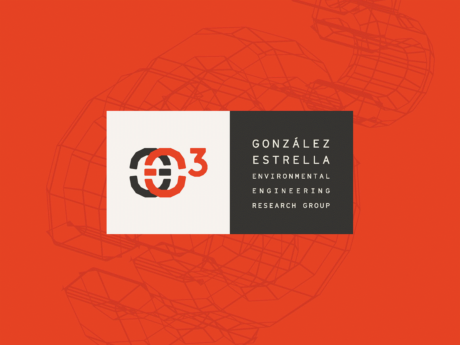
This is a selection of pages from an 11x8.5, 40+ page brand book for González–Estrella Environmental Engineering Research Group. LONG name, I know! So, GE3 for short. We decided to use the 3, combined with the founders initials (GE) to represent what appears like a chemical formula. The G and E are symmetrical shapes, to shorten the length, and provide a distinct mark. The two squares, mark and type, can be used together, or separate, and are the foundation for this modular system. They can stack horizontally or vertically, change colors from the palette, or the mark can be used on its own, outside of the square.
The groups mission, "investigate biological and physicochemical mechanisms driving degradation processes, mobility, and effects of contaminants on water and soil to advance knowledge and develop transformative environmental technologies". I'm honored to help give this group an identity that represents the vital and powerful work they are conducting.
Excited to watch how this system develops, and the vital work they are performing to make our lives and world better.


