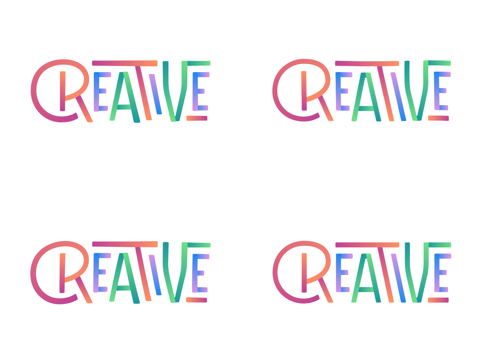
Just Trying to Be
I started out with some really clean, almost perfectly aligned vector lettering, but I kinda wanted it to have a more organic, semi-calligraphic feel. I tried to vary the the weighting, angles, and length of the strokes to mimic how I might have drawn it by hand with a marker or something. It hurt me a little to break the clean uniformity in favor of irregularities, and ultimately I was torn about it, so here's a GIF that wiggles between different versions.
More by Michael Stidham View profile
Like


