Dashboard - Project wiki / confluence practice
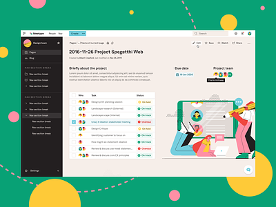
I wanted to practice creating a dashboard that included a lot of content and supportive actions that pushed me towards making the best use of the space available.
To achieve a balanced and easy reading experience, I used a 4px baseline grid to space out everything very tightly.
I had a big focus on ensuring that all text/colours are accessible and all content presented can still be clearly read.
Lastly, I've included a range of hover states such as the secondary edit button hover states and tooltip on team member's name.
illustration by pikisuperstar / Freepik
confluence
dashboard
design
desktop
document
documentation
project
project management
responsive
sketch
status
ui
web
website
wiki
View all tags
Posted on
Nov 28, 2019
More by Ben Low View profile
Like


