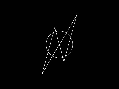
identity for 2013
This is an idea I've been bouncing around my head for sometime now. the 'p' and the 'd' have always been used as the basis for the pixeldeath logo. After trying some new typefaces, mainly light versions, I began to see a pattern emerging... a few days later and many dots 'joined', I'm quite happy with the new 'p' & 'd' combo mark that has come together.
See it in the wild here: http://www.pixeldeath.com
More by Cerven Cotter View profile
Like


