MyFitnessPal - Submit New Food - Modal

I'm a big fan of the MyFitnessPal app. I used it daily, but only on my phone, because the web app kinda sucks. It looks outdated and unorganized.
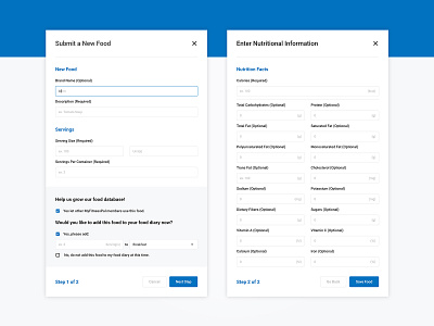
I took a shot at redesigning the "Submit New Food" form, just to see if I could make it look a bit cleaner and easier to use.
What do you think? Would you do anything different & why?
Let me know!


