Shift Logotype Refresh

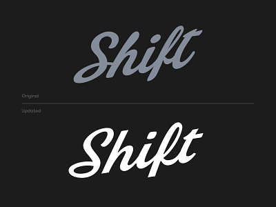


It was an honor to work on the script refresh for Shift Cannabis. Seemingly minute details can make or break a brand mark. The capital S in “Shift” plays a major role in setting the tone for the symbol. The original S felt forced and unnatural, so the goal was to create a much more fluid stroke. Another element we explored is the connection between the ‘f’ and ‘t’. The original type didn’t utilize a ligature between the two letters, so we worked on a few variations to give this connection a smoother flow.


