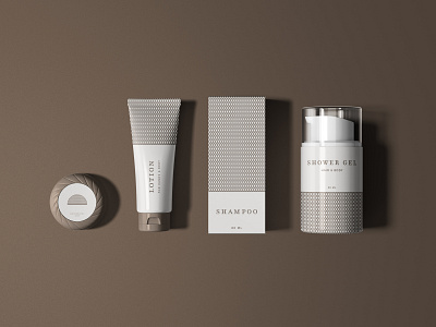
Basic Toiletry Packaging Design for 1948 Residence Inn
1948 Residence Inn
A local ancestral house is opening its doors for accommodation.
The family wanted the brand to have an updated look while still retaining its history and old-world charm. It needs to appeal to travelers both young and old as well as couples and families.
The logo was inspired by the black metal arches that surrounded the indoor pool. It has an intricate lattice pattern that you immediately get drawn to upon entering the house. This pattern was also spread out on wooden wall fixtures and railings, making it a very distinct feature and combining it with the brown and gold color and rustic serif font, has really captured the cozy ambiance of the house. This became an inspiration for the rest of the brand identity.
brand identity
branding
branding design
hotel
inn
lattice
lotion
motel
packaging
packaging design
shampoo
soap
toiletries
visual identity
View all tags
Posted on
Dec 25, 2019
More by Denise Uytiepo View profile
Like


