Storied Feedback

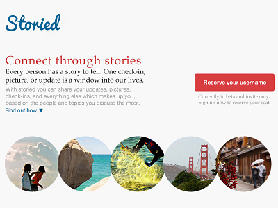
Hey Brian, love that storied is about to finally come out! Here is some feedback I had and my take on the overall design. The color scheme for this project is amazing, it really gives you that human feel. I also love the typeface you chose, not sure if I matched it perfectly. I did a couple things with the rebound. I felt the header was a bit vague, so I tried to boil it down to 3-4 powerful words. I also continued the story :) with the sub header by trying to humanize the message further and convey the value of the little pieces of content people might not think much about.
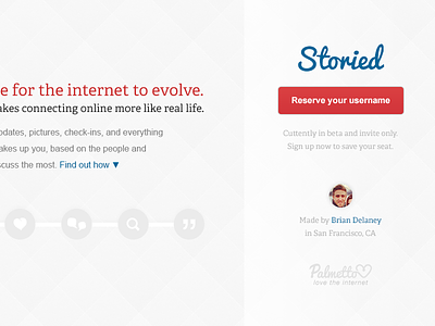
The biggest thing you probably notice is the pictures. This aligns with the theme of pushing the importance of re-humanizing the internet through stories. In this context by showing both people (friendships, relationships, fun activities) and destinations we can evoke some visceral feelings out of anyone browsing this site. I was also able to keep the right column distinction you had for the call to action. I removed anything else that distracted from that goal.
I wasn't sure how find out how works, but I felt it could be cool to have stories that show how you are able to transform a simple check-in with storied. Or how you are able to make a topic about the golden gate bridge even more amazing with others.
All in all your design is incredibly clean and well structured, I was just hoping to humanize it a bit more. Would be happy to discuss more about this project with you. As always feedback welcome!