Elm Logo

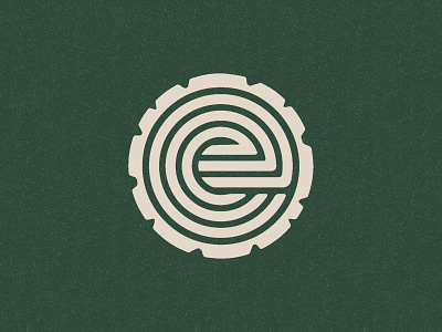


Working on a logo for a financial management/growth company named Elm. Was messing around with this idea of and "e" + tree rings to symbolize trackable growth.
Could use some help with the mark. I've got a few different weights here that I think all emphasize different aspects of the logo. I feel 1 & 2 lean into the tree ring motif a little more while 3 lets your eye see the "e" first. Any tips/preferences here?
One of the main points the CEO said in discovery was "Investing is not a game, it's a garden. You need to tend to it and take care of it." So I wanted to lean into that idea and keep things feeling natural while recognizing that this is still essentially a tech company.


