UK Fashion Brand Logo Concept


Secondary concept for MolesyCo which is a new UK outdoor leisure brand: clothing, boots, accessories, shoes, hats etc.
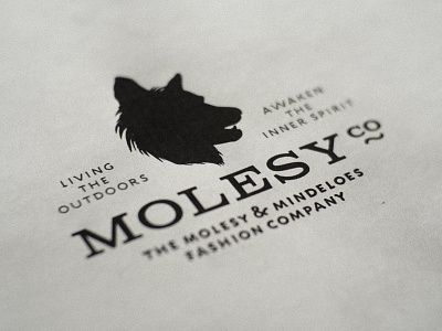
A few specific requirements of th ebrief included the need to reflect the never ending popularity of the 'used vintage label brand' style whilst incorporating some smart typography and unique logo mark.
In this case the logo mark was to be an animal of some kind, ideally a dog. The challenge with any kind of dog mark is the risk that it could look more like a pet brand rather than a clothing brand for humans.
My 2 cents was that we create a hyrbid dog/wolf/husky mark so as to also create a link to the outdoor adventure spirit of wild wolves, huskies, and the original use of the German Shepherd to watch and protect the farmers/shepherds flock.
For those that know my love for dogs, and in particular my own Mr Dylan (Lurcher) and Miss Charley (Black German Shepherd) you'd be correct in thinking I used Charley as a model for this mark. :)
Shortening the snout a little, creating more of a chiselled forehead and brow and adding some nice wild 'fur' helps create a unique 'mascot' called Molesy. Important not to make the animal too wild, too frightening or 'rabid', but also not too cute or domestic pet dog, so striking that balance has been a fun challenge with very minor tweaks making big visual differences.
Tag lines
The brief only came with the brand name, Molsey, with no requests for a tag line, let alone additional copy. So I believed that working on some phrases would help define the brand 'mood' as well as provide useful visual elements to help me carve the logo design.
Currently playing with tag lines etc, so the 'Living the Outdoors', and Awaken the Inner Spirit' are more placeholders until we can create something else, but the idea of 'living in the out doors', and awakening that inner self to spend more time outside in the wild holds true to the nature of this fashion brand, and the brand mark that represents it.
Typography
For those that are curious I used 'Columbia Titling' for the main brand name, and 'Engine Caps' for the tag lines.
Photography
For this main image I printed the logo out on standard inkjet printer, then used the really really cool SLR Magic 35mm F1.7 lens, on my Olympus OM-D E-M5 to take the photograph.


