Granado Lettering Take 2

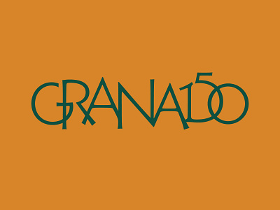

Here's another take on the 150 year logo for Granado. This time, instead of taking the Art Nuveau route, we tried to make a version that's both traditional - Roman Capitals - and more contemporary in feel, being a Optima like sans-serif and all. The overlaps help to create a cohesive logo and the 150 is probably more readable than before. This one made it to the final rounds. It didn't make the cut because it was deemed too horizontal for their multi-purpose intentions.
There's a load more of sketches in our instagram: https://www.instagram.com/p/B7V7NHvJ49V/


