Fixes Contact Manager

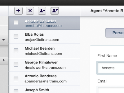
I think it would be great if you didn't go with all blue monotones. It's often the mark of someone who isn't good with color when they use all one hue for the website. Add in some black into the blue hues. #2a2a2a is a great black. For any controls or buttons make them darker unless they are disabled, and even then they should be darker than the rows.
You're over killing it with the shadow from every corner, especially the dark, then 1px highlight you're doing on the left side of the contacts, and on every piece.
Try not to divide things up so much. Well laid out design will look segmented with proper whitespacing, and won't need lots of divider lines. You should strive to make the divider lines obvious through negative space (white space invisible)
Hope this gives you some great ideas… Your contact manager is really looking good!


