Instant Data Visualisation | DummyCompany+

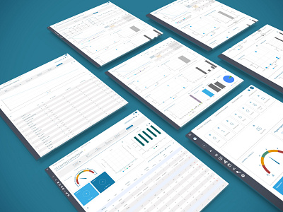


Demonstrating the UI of our dynamic data tables and reports. Users can select specific rows of data to generate chart visuals from, whilst making smart use of as much above-fold screen real estate as possible. Since the application is already complex, being data-heavy and full of intricate functionalities, it was important that the reports module be as pain-free as possible; with this mind, the design ensures that the chart visuals of every select/deselect displays seamlessly without any page refresh, and with easily distinguishable colours and labels.
N.B. DummyCompany+ is the false name I'm using in this project in place of the actual company name to preserve confidentiality.


