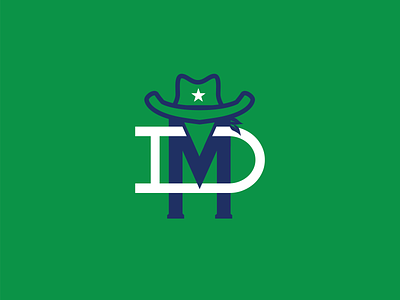
Dallas Mavericks monogram
This is the first logo in the series I plan on doing where I will redesign all of the NBA logos as monograms. I’m not a Mavericks fan, and I’m honestly not a fan of their current logo either. It’s a bit... horsey. However, I really like the Mavericks throwback green/blue palette more than their blue/dark blue one. I think it’s hard to design an NBA logo and resist the urge to shove a basketball somewhere. What do you guys think?
dallas
dallas mavericks
logo
logo design
mavericks
monogram
monogram logo
nba
nba logo
texas
vector
vector logo
View all tags
Posted on
Jan 24, 2020
More by Trevor Grouss View profile
Like


