7 Sins bar & restaurant colour exploration

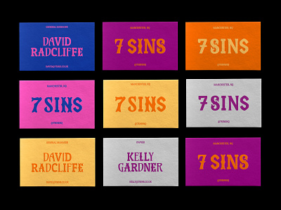
Colour exploration for the 7 Sins bar and restaurant brand - in practise on a set of business cards.
The USP of the bar space is gamification, with pool tables, arcade machines and shulf board. For that reason we gave the brand a "dark carnival" feel. Bringing together the themes of Manchester nightlife and a fun environment.
As a result, here are the carnival multicolours we chose to bring the brand to life.
(Part of my brand design work at Persona Studio.)


