Japanese Food Yummm

One of the four directions we got goin on...
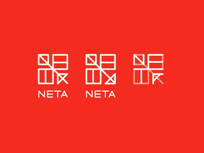
"Neta" is a japanese word meaning the ingredients of sushi. This restaurant uses the ingredients in new and creative ways. Love that this direction for the branding combines traditional Japanese visual language with a modern twist. Was also playing with the idea of a flying fish. Sushi restaurants often use a fish in their branding, so I thought giving it wings would also give it a unique twist. And the eggs from flying fish are an ingredient in sushi, tobiko! Love that this mark both has the letters of Neta in it, and also looks like a flying fish from above.
(Need to do more research to see if this resembles an actual Japanese character..)


