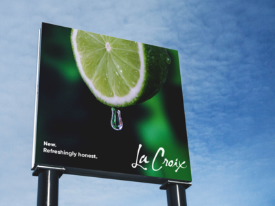
This actually started out as a poster until I realized the arrangement and cropping would be more ideal for a billboard. Really pushing the big, "fresh" imagery here.
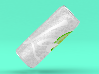
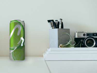
A quick mockup of my idea for new packaging, keeping in mind that the focus is on the recognizability of the wordmark. The idea is that the can would change depending on the flavor, as it does now, but with photorealistic representations...
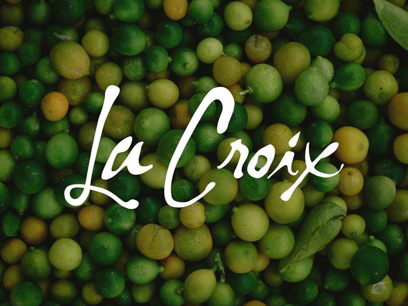
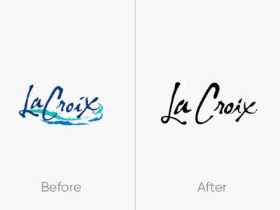
As I mentioned in the last post, the previous wordmark achieved something between infamy and icon-status. Therefore, removing it entirely would be shortsighted, so I opted instead to clean it up and remove those swooshes.
The result is...
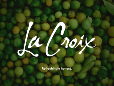
La Croix is a brand I really like – so do a lot of other people apparently – but I feel that they don't really have a grasp on why they are suddenly relevant again, and aren't necessarily in a position to capitalize on that as much as th...