Card Detail Updates


We launched an update to the Cards page a few weeks back, therein were a few interesting details and design problems to share. In no particular order...
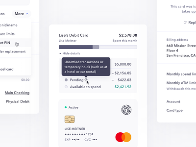
The header. This was definitely my favorite part of the redesign. We placed greater emphasis on card nickname by pulling less important properties down into the metadata section, and added a spend bar with associated details. This gave folks a quick idea of how much remained on their cards spending limit without doing math, and provided extra specificity in a collapsible details section. Pending transactions in particular can be volatile, or represent an amount that temporarily impacts your limit but is unlikely to turn into a posted charge (holds for hotels or car rentals are the common case). Additionally, if the associated account has a balance lower than your card's remaining limit, we can be clear about that, and help users understand why they're unable to spend the full limit.
States. Physical cards in particular had the added complexity of requiring an unactivated state while in transit, but beyond that there's everything from a frozen card, archived, locked, and more. Figma Variants really helped me stay on top of all the different permutations of the detail view, and made it easy to swap things around and test ideas. You can check out the last page for details, but there were a bunch of different variants at play.
Metadata. As we launch new features and expand the definition of what a card is and can do, there will be more information necessary to describe a card. I kept billing address separate from that pile of metadata to help folks easily find what they need most: card details to buy things. There were a bunch of small visual changes here (like putting the "billing address" label on top of the address itself rather than in a two-column layout, to prevent line breaks on long addresses), and some interesting interaction design problems (if you have permission, you can simply click on a limit amount to edit it, rather than going into the More menu).
Some other little things. We were also able to easily add card filters by re-using the Transaction Filters component I designed last year. We also adjusted the table, to keep both nicknames and card numbers on-screen—even in detail mode.
Check out the live demo, I'd love your feedback. If you want to work with me on online banking stuff, our Product Designer role is perpetually open as we expand the team. Cheers! ✌️


