Trek Bicycles Site Redesign


View the real pixels
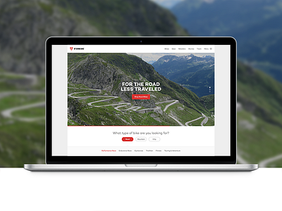
I'm a big Trek fan. I spend a majority of my free time on my Madone. I frequent their website often (trekbikes.com). I noticed that it was recently redesigned. Unfortunately, I still have frustrations with the navigation. I personally feel that it takes too many clicks to get to the bikes.
So, I designed a new responsive layout for the homepage, one that i think allows the user to quickly & easily narrow their scope in order to find the perfect set of wheels. I tried not to stray too far away from what Trek has already established as far as type and color and such.
Just a 'lil evening design exercise.
For the record, I don't intend to offend anyone who originally worked on this.
:)
Cheers.


