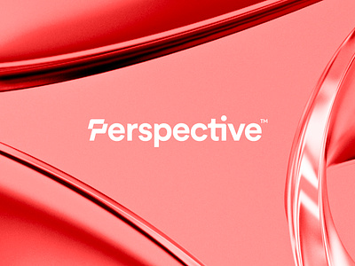
Perspective - Logo Redesign
Perspective is your own small team of designers & Webflow specialists. Packed in one easy-to-manage subscription.
Challenge
My main challenge was to come up with and design a solution as a wordmark, with the first letter P to be prominent to also work as a standalone mark. As one of their older logos embraced the 'interaction' symbol, I decided to find a new approach to this particular element. Incorporating it into the wordmark can work well in full-text usage or symbol standalone.
Concept Development
During the project, I explored several concept directions, which is one of the most enjoyable parts of the project for me. I get to experiment with different combinations of building blocks, such as iconographic parts and letters, to come up with an original and creative mix that perfectly suits the brand. In this particular project, I was tasked with creating a letter "P" logo that would eventually fit into a word mark. After careful consideration, the client selected a more natural-looking P (in red) and I continued to develop it to make it a perfect fit within the full word.
Brand identity timeline
Over the past few years, Perspective Design has used two different brand identities. As the company grew and attracted more clients, it realized that its current brand image did not fully reflect its team of creatives and professionals, nor did it align with its future goals. As a result, they decided to make a slight redesign themselves, resulting in a second logo. However, even after some time, they still felt that something was missing and that their brand image did not fully meet their expectations or convey the right message to their customers.
To address these concerns, they decided to hire me to create a better solution that would align with their current state and reflect their vision for the future as a team. My proposal met all of their criteria and felt like the perfect transition to enhance their brand image and overall aesthetic. With this new and improved branding, Perspective Design is now able to better represent its values and meet its goals for growth and success in the years to come.
Thank you for your visit!
See this new logo live on their website.
Huge thanks for the amazing support and also during the 'finetuning' stages for the finalization of this concept. We all are super excited about this redesign and I am proud to share the outcome with my Dribbble family here!
_______________________________________________________________________
_______________________________________________________________________
Want to work with me on your project?
Feel free to reach out via DM or email:
👉 info@jeroenvaneerden.nl / www.jeroenvaneerden.nl
💼 Connect with me on LinkedIn / Read my Client Recommendations
🎬 Check my YouTube for Logo Tutorials / Learn Logo Design
🔗 Follow me on Instagram / See BTS and New Content
💬 Tweet with me


