Mobile Responsive Website


💌 Have a website idea? Let's bring it to life together!
hello@ronasit.com | Telegram | WhatsApp | Website
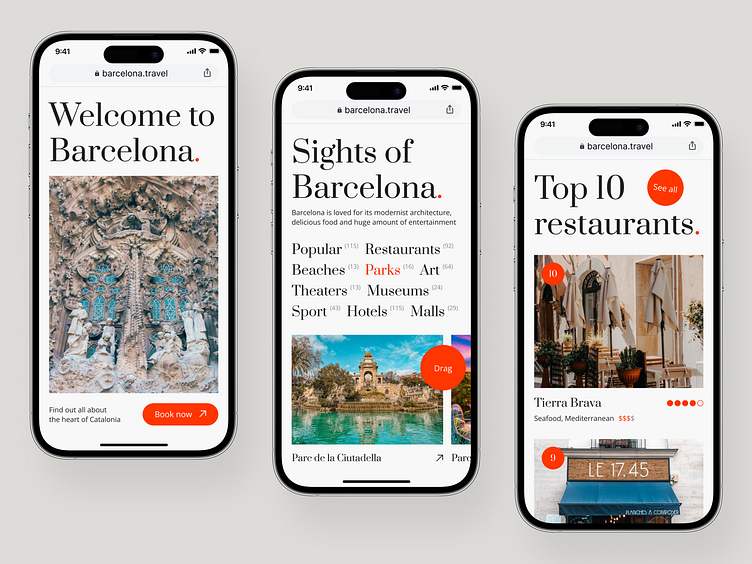
Our design team has crafted a UI/UX design for a mobile version of a website centered around the panoramic city of Barcelona. The site serves as a comprehensive guide to the city, offering users insights into the iconic landmarks, city's popular eateries, hotel ratings and a curated list of upcoming events.
The website navigation is divided into four functional areas. The main screen warmly welcomes users with a city overview, while the 'Signts of Barcelona' section categorizes the various city landmarks for easy navigation.

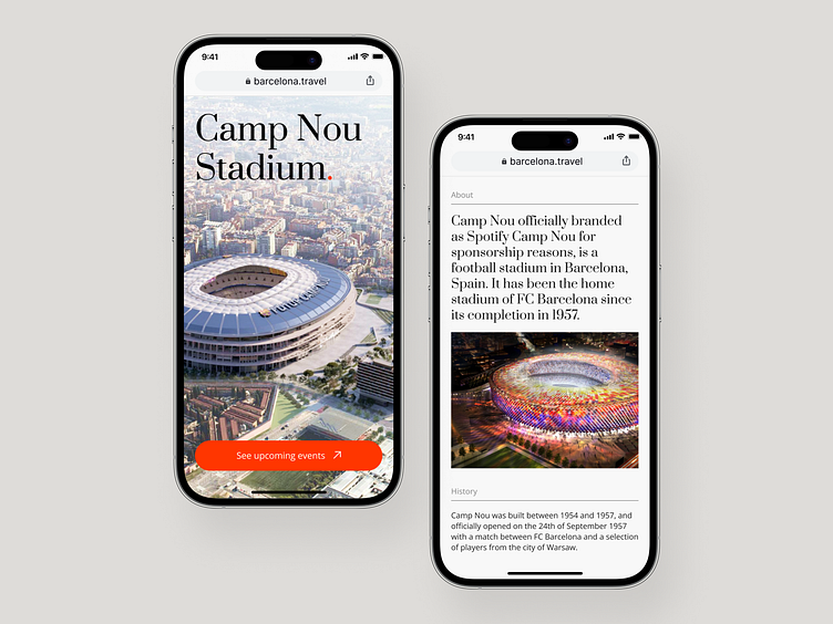
Each landmark is presented on a separate page that narratively describes its historical significance and provides necessary details. Furthermore, the 'Top 10 restaurants' page ranks the city's restaurants based on user reviews and ratings, thus aiding tourists in finding the best dining options.
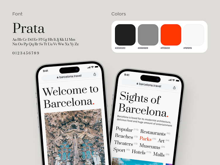
Keeping in mind the overall aesthetic, the design of the website emphasizes a classic minimalistic approach, focusing on subtle shades of black and white. To contrast the monochromatic nuances and bring an aspect of vivaciousness, a bright, eye-catching shade of orange is used as an accent color. This shade reflects the sun-kissed landscapes and the lively culture of Spain.