Apoxy Brand Identity, 2023

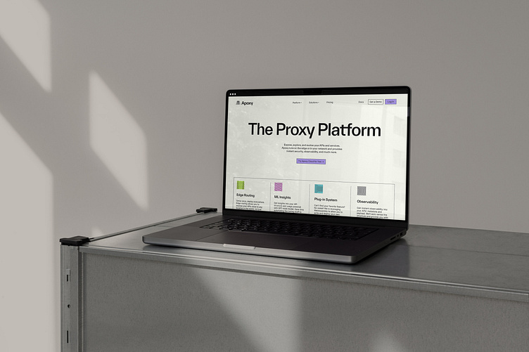
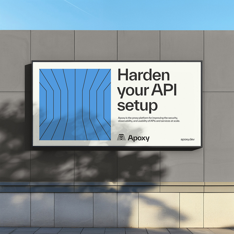
Apoxy is a proxy platform for improving the security, observability, and usability of APIs and services at scale. Their programmable proxy allows developers to write code that handles the operational concerns of their applications rather than piles of configuration. I worked with Apoxy just before their selection into YCombinator S23 to develop a flexible and cohesive brand identity that communicated the complex functions that Apoxy handles behind the scenes in order to harden developer API infrastructure and keep everything running efficiently and securely. Visually communicating abstract concepts like data, integrations, proxies, and APIs is always an interesting challenge.
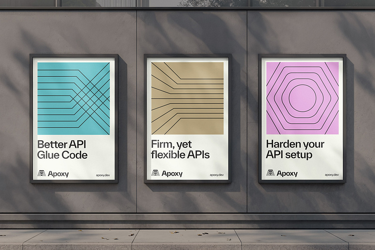
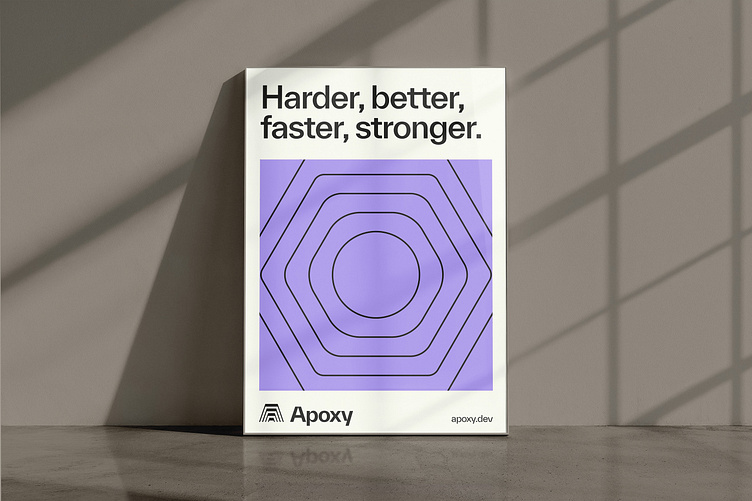
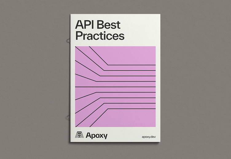
For this concept, I landed on a simple, monoweight illustration style that played off of the negative space in the mark. Leveraging that device into a small illustration bank, I created a flexible system that was appropriate and functional for the stage of the company. The color palette is versatile in that it is able to feel both mid-century as well as fresh and contemporary.
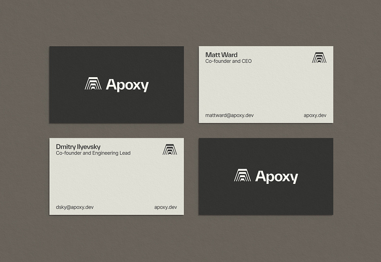
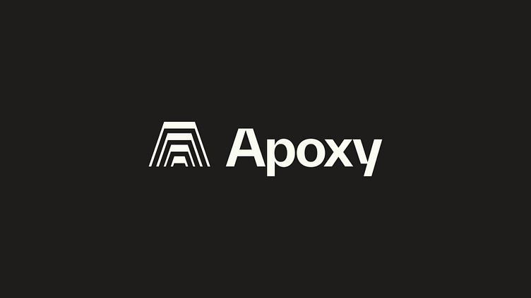
The small mark/favicon is a more simplified, 3-line version of the full mark, allowing it to work at a smaller size while still feeling consistent and crisp.