NNC Immigration Logo Design Concept

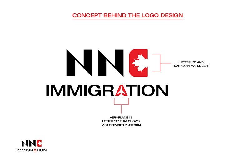
The logo for NNC Immigration is crafted with specific elements that symbolically represent the services and ethos of the company, which focuses on assisting clients with immigration to Canada.
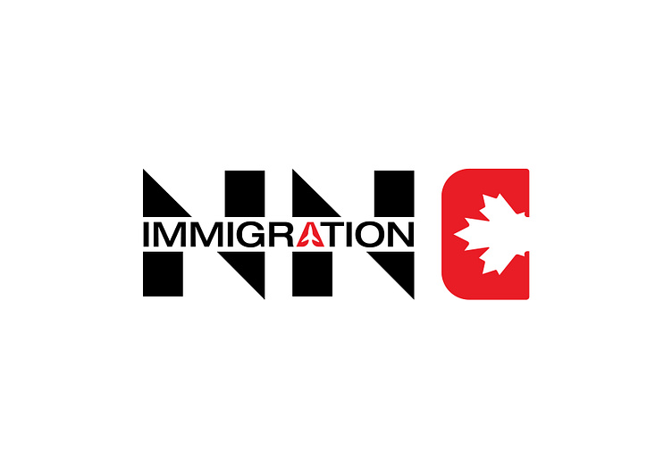
Lettering Style and Format: The logo features bold, uppercase letters for "NNC" which stands out for its clarity and authority, suggesting a reliable and professional service. The large, prominent text indicates that NNC Immigration is a strong presence in the immigration service sector.
Maple Leaf in the Letter "C": Integrating the iconic Canadian maple leaf into the letter "C" is a standout feature. This design choice instantly connects the logo with Canada, pointing to the company's specialization in Canadian immigration. The maple leaf is a national symbol of Canada, widely recognized and associated with Canadian values and identity.
Aeroplane in the Letter "A": Subtly incorporating an aeroplane into the negative space of the letter "A" under the word "IMMIGRATION" cleverly hints at travel and the overseas journey many of NNC's clients undertake. This element underscores the company’s role in facilitating the movement of people across borders.
Color Scheme: The logo uses a stark contrast of black and red, colors which are often associated with strength, determination, and passion. The red, particularly in the context of the maple leaf, not only draws attention but also evokes a sense of Canadian pride and heritage.
Overall, the logo of NNC Immigration is designed to convey a sense of trust, authority, and direct connection to Canada, making it clear and effective for its target audience of potential immigrants.