The Jasmine Dragon

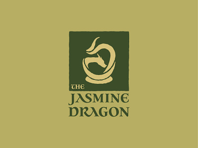
I was actually kind of surprised when I started this logo to find that after 12 years there aren't really many logos made for The Jasmine Dragon that aren't a Starbucks parody. And that's fun and all, but I thought it'd be cool to design a logo that would actually function for the tea shop. That and I'm a huge Iroh fan so this is my way of claiming my own little corner of that fandom.
I knew from the start that I wanted to work the dragon's body and steam together, the original idea being that the dragon would be the steam coming out of a cup. In logo design, though, you sometimes (honestly, usually) have to take these bigger concepts and recombine and abstract them down to something simpler. And that's how I got to the dragon not just making up the steam, but the tea cup itself too. Removing the cup as its own object allowed the mark to become more unified as a design.


