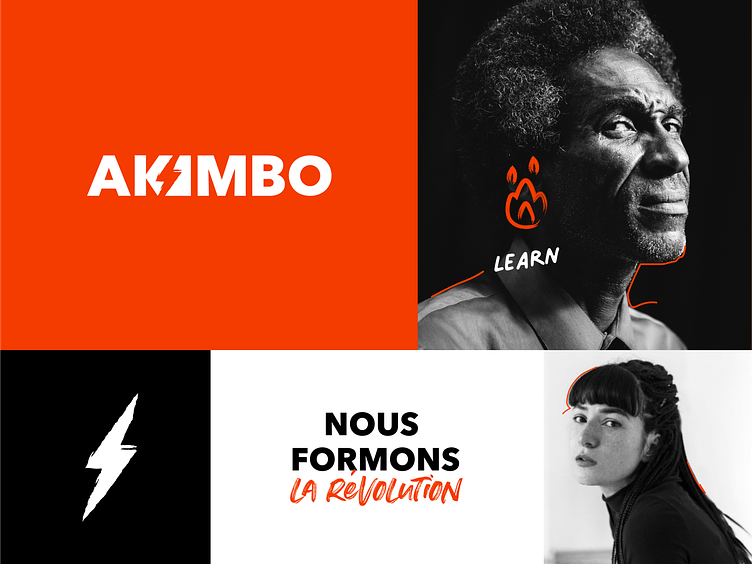
Akimbo Logo


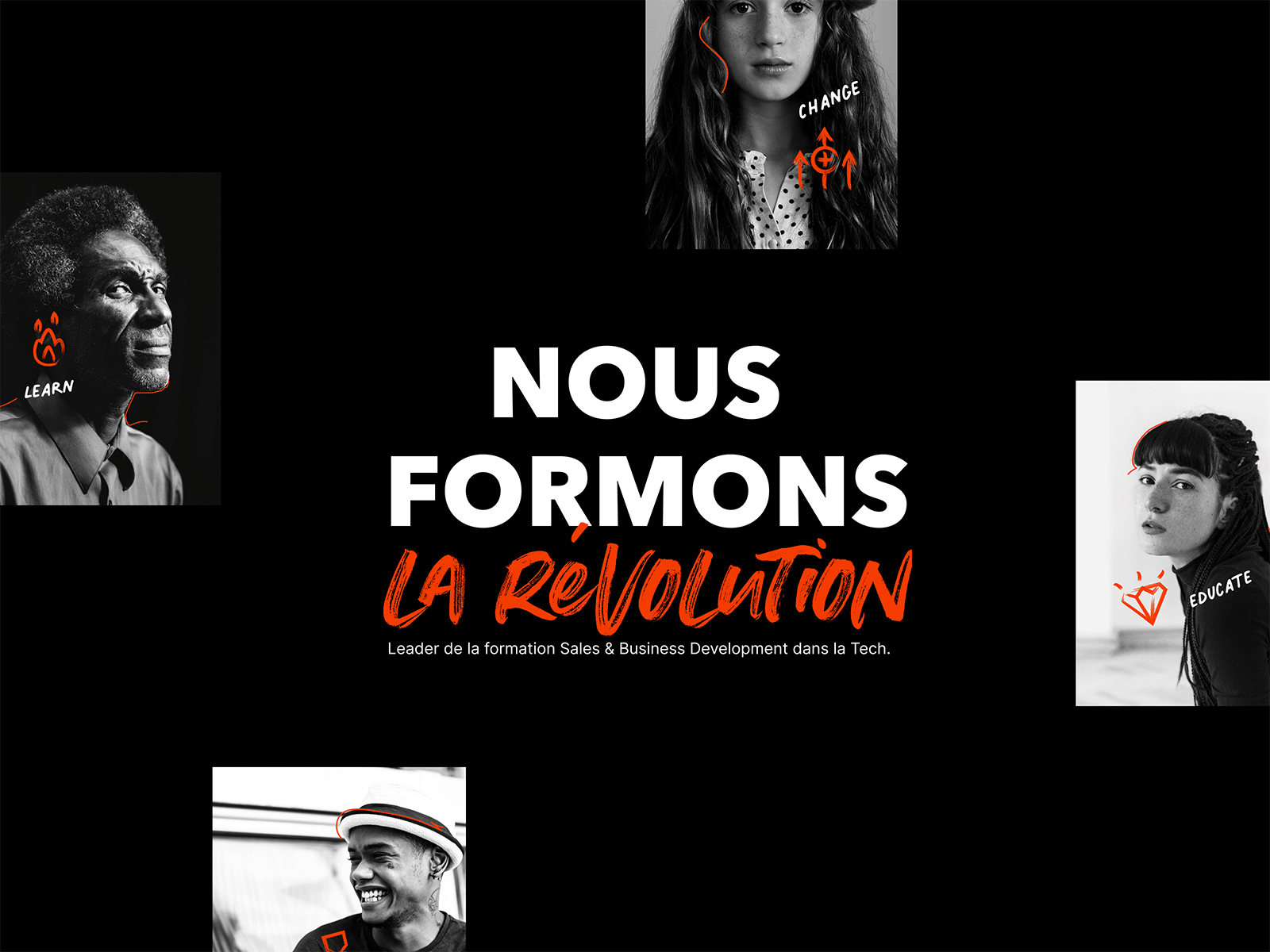
Akimbo revolutionizes
the way Sales people are trained
The brand wanted to implement a strong and impactful identity, built around the idea of revolution and rebellion against the pre-established scheme of sales training.
Inspirations for revolution
A moodboard was used to identify revolutionary trends and symbols in the scientific, societal and political fields as well as the notions of impact, freedom and change.

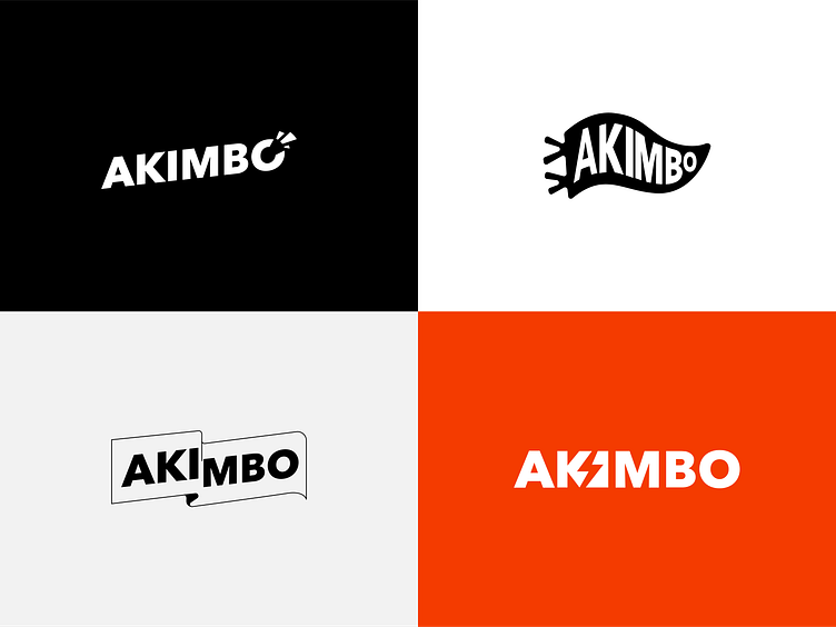
Explorations
Several directions were explored around the idea of impact, flag / banner. Typographic modifications or distortions allowed us to work around several forms and symbols.
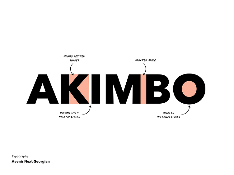
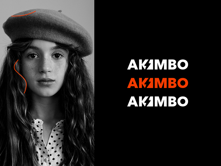
Typography
The avenir next georgian typography was chosen for its sobriety and its readability, essential for the conception of a logo. The proportions of certain letters as well as the spacing were then reworked.
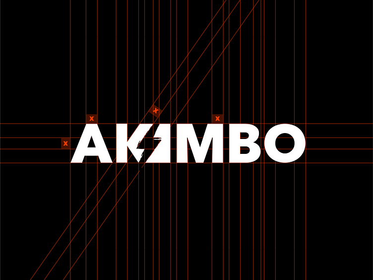
Grid
The logo and icon were then placed in a construction grid to highlight the chosen ratios and proportions.
Made with 🧡 by Bruno