Dashboard - User lifecycle UI


Dashboard - User lifecycle UI
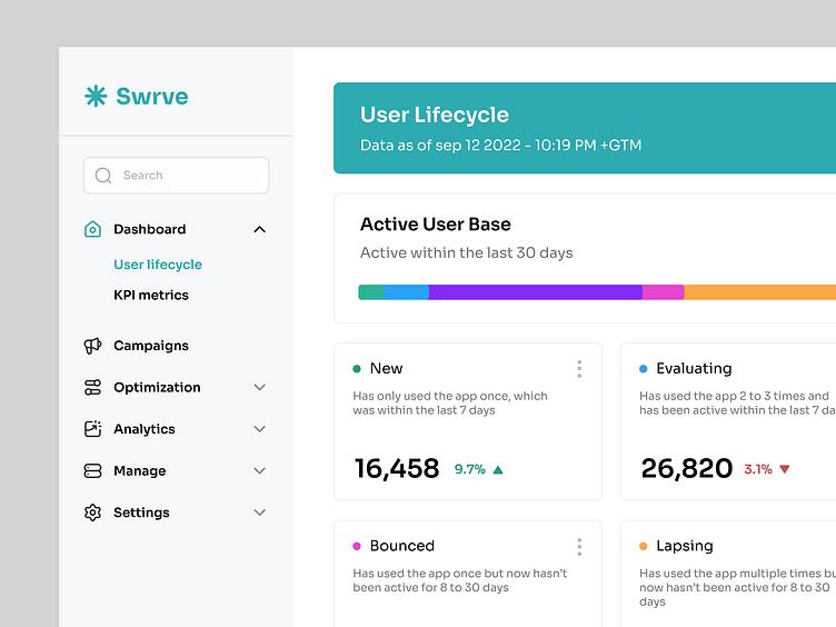
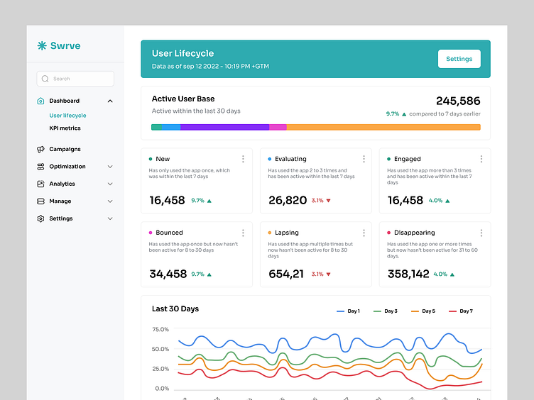
Active User Base
The Active User Base section of the screen displays the total number of active users, the change in the active user base over a selected time period, and the percentage breakdown of each user state (except disappearing). Hover over the colored sections of the bar to view the percentage breakdown of each state.
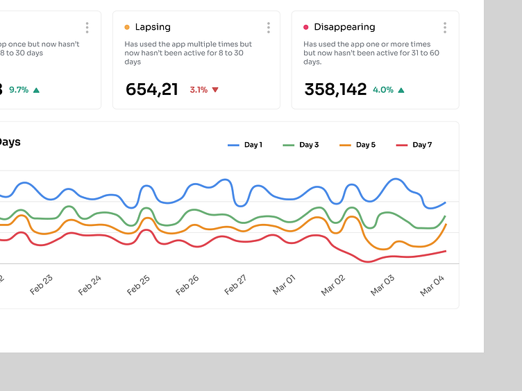
User lifecycle cards
The details of each user state are displayed on six ‘cards’. Each card shows the definition of each state, the number of users in that state and the change over the selected time period. Changes are represented by a percentage value and an arrow that indicates if the number has increased or decreased. Each card also includes a menu that enables you to target the users in that state with an in-app message, push notification or conversation campaign.
The numbers that display for each state reflect the total number of users who match the criteria. The data is refreshed on a daily basis. This is not a daily active user (DAU) or monthly active user (MAU) count, but a total user count as of the time and date displayed beneath the Active User Base title. By default, each card also displays the percentage change from seven days ago; however, you can change this on the User Lifecycle Settings screen to compare against 30 days ago or 24 hours ago.
And more...
-----------------------------------------------------------
👋🏻 Let's chat for project discussions-
hisalim.ux@gmail.com