Herschel™: Official Update #1 - Adding Lowercase

After spending another 40 hours or so in Herschel, I was enjoying the designs and process so much that I decided to do what was "unthinkable" for me when I first started: designing the lowercase. I've only spent a few hours on the lowercase so far and haven't done much spacing or kerning either, but I want to give a brief update for interested persons. I'll be releasing the full version of Herschel with upper and lower case and lots of stylistic alternates, ligatures, AND in several weights and widths. This is a massive undertaking on top of other projects and I'm nowhere near finished, but be excited and be patient I'm now more excited than ever to release Herschel and believe that this will be an incredibly exciting and unique addition to the world of typefaces and fonts. Stay tuned for more progress shots, updates, and more in the near future!
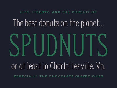
Also, if you don't know about Spudnuts, learn.


