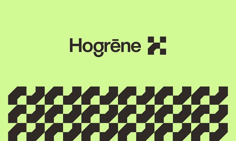
Hogrēne Logo Design


See the complete case study.
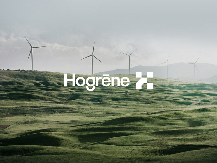
Why Hogrēne?
Swedish, högre=Upper, signifying the northern European region i.e., Scandinavia; and Old English, grēne=green.
The name signifies the usage of sustainable energy resources, such as solar, hydro, wind, and geothermal.
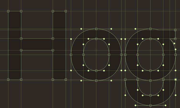
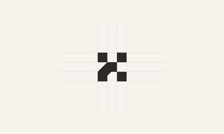
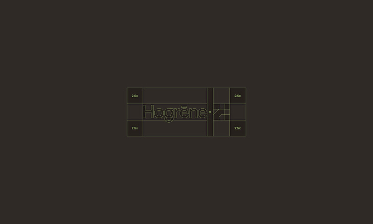
Our goal for this logo mark was to craft a visually striking artwork that integrates geometric square shapes and forms an abstract representation of the letter H. We intended to establish a solid visual language that aligns with the brand's core values and messaging to effectively communicate its essence to its target audience.
Show some love 🖤🤍🖤 and press "L" to support our work.
---
Interested in partnering with us?
Get in touch at hello@unikostudio.co or visit our website unikostudio.co.
Follow our updates on:

Show some love 🖤🤍🖤 and press "L" to support our work.
---
Interested in partnering with us?
Get in touch at hello@unikostudio.co or visit our website unikostudio.co.
Follow our updates on:


