Strike Sports Branding.


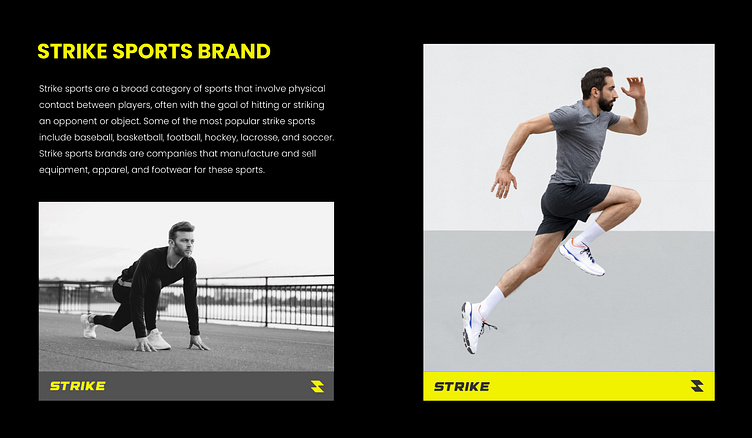
As a designer, I was tasked with creating a brand identity for Strike Sports that would capture the essence of athletic excellence and inspire people to pursue their fitness goals. I wanted to create a brand that was both visually impactful and emotionally resonant, drawing inspiration from the power, speed, and determination that athletes bring to every competition.
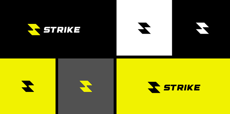
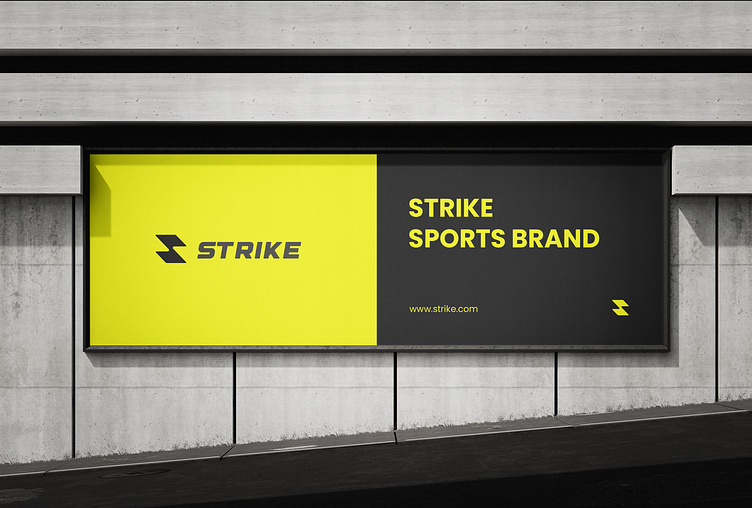
Color Palette:
Yellow: Yellow is a bright and cheerful color that is often associated with happiness, energy, and optimism. It is a good choice for branding that wants to convey a sense of fun and excitement.
Black: Black is a classic and versatile color that can be used to create a variety of different moods. It is a good choice for branding that wants to be both professional and stylish.
White and grey: White and grey are neutral colors that can be used to create a sense of balance and sophistication. They are also good choices for branding that needs to be accessible to people with visual impairments.