Dominos Slice - anyone care for a rebrand?

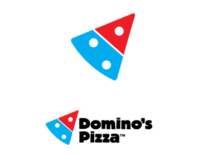


I was sitting outside the local Domino's recently and got to thinking just how disassociated their logo is from what they do... I mean, a domino piece in red and blue with the name set in Futura Extra Bold Condensed? If any one of us went to a restaurant and said your name is Checkers so here's a checker board for a logo we would probably be told to 'try harder'.
So that's where my idea came from - why not have a brand that retains the equity of the current colours and domino piece but actually speaks to the whole idea of pizza. Thus was born the Domino slice logo... in my mind a vastly more representative identity that visually conveys the idea of pizza portions with the domino playing piece. A succinct identity that showcases the company name and the product they sell in one compelling graphic.
In addition, the logotype has had a tweak also, now set in Block T Heavy which, in my mind, looks like pizza... thick, crusty with a slightly organic feel. Futura Extra Bold Condensed is just a little clinical for my liking.


