Atlanta Falcons Rebrand Concept

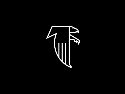
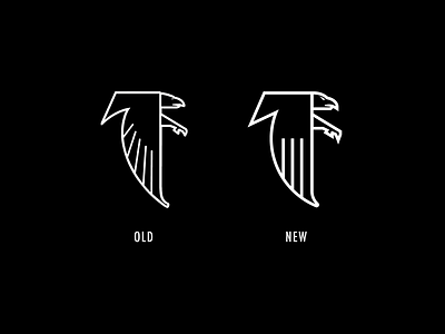
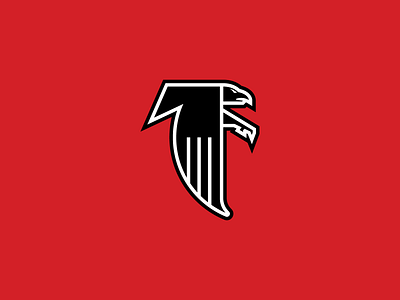

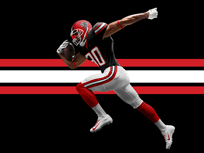
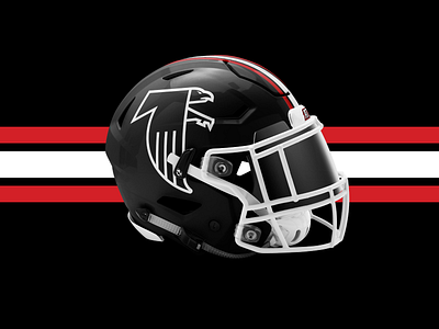
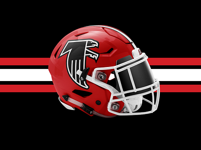
I have always loved the 1966 original Atlanta Falcons logo. I wish they would use it as their primary mark. This rebrand refinement includes a bolder keyline and consistent line weights, matching angles and curves, and a new fierce eye that resembles the current Atlanta Falcons' logo.
Huge props for the dope mockups Brandon Williams: https://www.webpixum.com/webpixum-football-mockups


