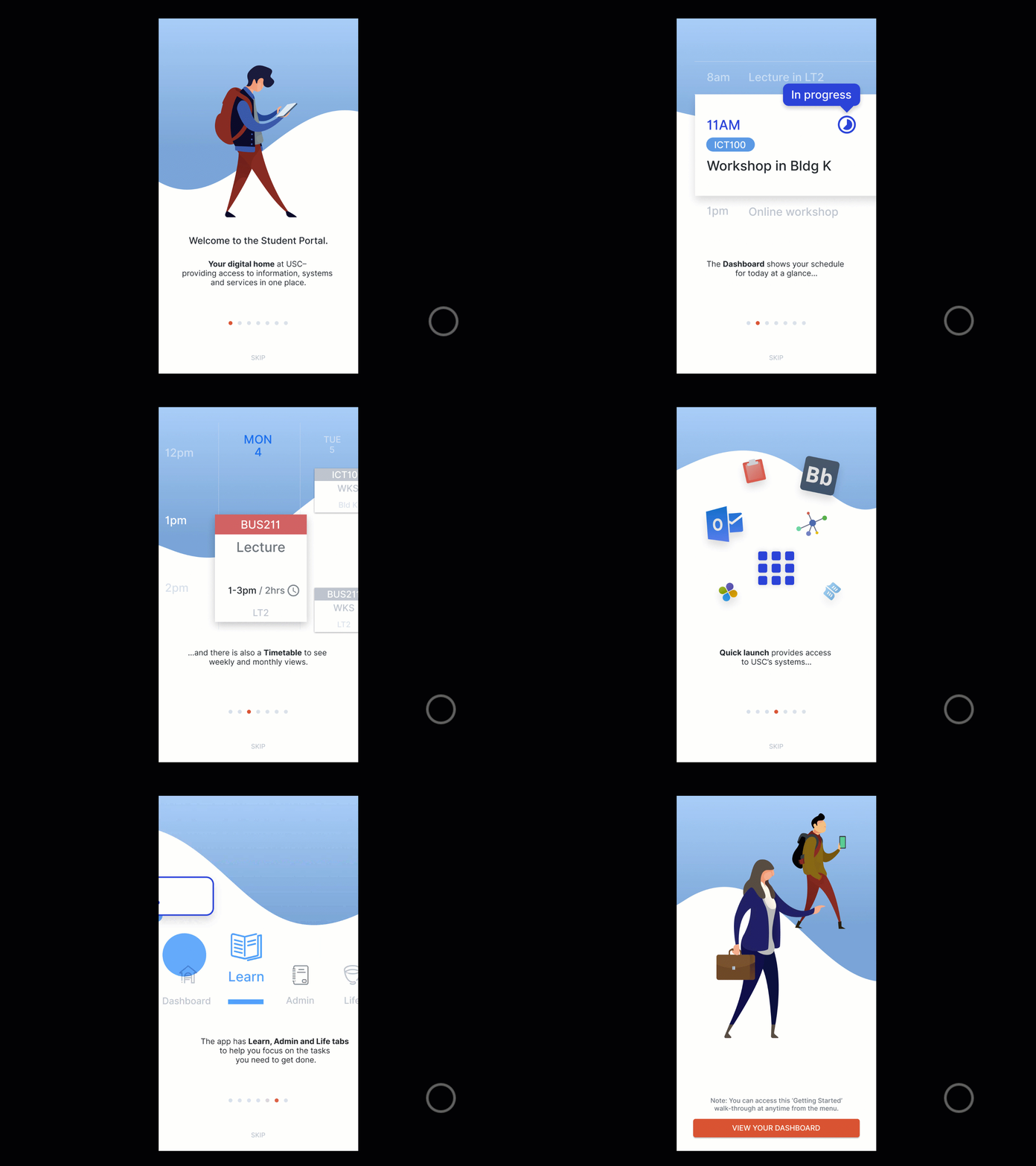
Highlighting the features of new student mobile app
I put together these 'onboarding' screens to highlight the features of a new student portal app.
Each feature has a visual using elements from the UI– I didn't want to show literal UI screens as the users have never used it (at this point).
I wanted a visual that highlighted the feature and complimented the description.
You will have never seen this app or used– Do you the visuals are engaging? Do they make sense alongside the description?
View all tags
Posted on
Apr 21, 2020
More by Tim Jensen View profile
Like


