Grand Rapids Griffins: 80s Night

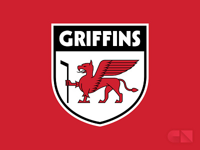
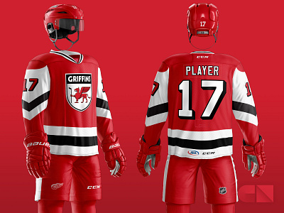

My submission for the Griffins' annual uniform design contest in 2017. That year the theme was "80s night". The requirements were to maintain the team's current helmet and pants (which are basically the same as the parent club Detroit Red Wings), and create a new, unique logo and jersey + sock design, using the team colors of red and black.
In my mind, 1980s hockey design means bold, simple color schemes, big, chunky stripes, block numbers, and logos that use a lot of detailed line work—not the overly aggressive, heavily shaded and symmetrical logos popular today. I drew inspiration from, among other things, the Canucks' flying skate logo and a couple of iconic animals: the USPS eagle and the Mobile Gas pegasus. I used Kabel (one of my favorite fonts) for the word mark, because it screams 70s/80s classy aesthetic to me.
I designed the jersey striping in a style similar to the Pittsburgh Penguins, but different enough so as to look unique; I did not want to merely recolor a well-known existing jersey template.


