Updated Stark Contrast Checker UI


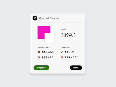
Say hello to the updated contrast checker UI on Stark. It was designed with a few things in mind:
1. To be more compact so it doesn’t take up too much space on your screen.
2. Make it a bit more modern, as the other was starting to feel dated.
3. Andddd set the base for upcoming features!
Stoked with how it turned out and we were thrilled to see the community chime in and help make tweaks, too. <3


