LG(B)TQIAP+ a Hand // Petri Dish 06/15 - Logolounge 2020


Trend Report // B Logo Exercise ⠀
⠀
This side-project is meant to be an exercise on the logo trends of the year. As I've said on the previous posts, my motivation is just to study the trends and hopefully create interesting concepts using it as platform, experience some new styles, etc. I hope you enjoy this project with me (feel free for check the 1, 2, 3, 4 and 4)!
(also I haven't any logo selected for this years publication, so maybe resentment could be a bit of motivation agent here haha) ⠀
⠀
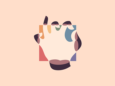
I know this one isn't quite the exactly trend (also, I've noticed I'me not good at stay on the trend track); but I tried to keep the main idea of the multiple shapes delimited by a single and simple square or circle, like a frame. I've been certainly influenced by the recent news and topic been discussed on public agenda; so I just give a hand on this debate. The approach of the glass are intented to be the prisma idea used in a different context, I don't know what people can interpretate from this illustrational logo, but will be interesting to know! Put in simple words: a hand grabing a piece of glass in rainbow colors.
⠀
I don't know even if this is suitable as a logo, although there's a simplified version in one color; maybe is too complex in terms of design and also a complex concept behind it. What do you people think? Would be nice to hear what you see on this concept :)
⠀
Plus, I've decided to work on a fictional logo concept for each of the sections created for the Logolounge 2020 Trend Report.
So I'm excited to try this new stuff and hope you guys enjoy this quick journey with me as well! ⠀
⠀
The description of the trend I'm following on this shot is above, I'd love to keep the discussion on this topic flow so here goes the text: ⠀
⠀
"I’ve always thought of a petri dish as a fully contained eco-system that investigates bacteria and other phenomenon. Those clear dishes serve as our little round window into discovery of the unknown, while sealed to protect us from their content. Exactly like these logos. These micro views of a macro world are tightly cropped shots, often framed in a simple circle or square. That cropping purposefully focuses the consumer on just enough detail to extrapolate the rest of the story.
Swimming in these pools are right angles, arcs, points and curves—just enough to telegraph the actual contents as circles, squares, stars or whatever the visual totem happens to be. This places faith in the public’s participation and their deductive skills at ferreting out the intended message. Dana-Farber captures the arc of a D and the right angle of an F coming together to form a human with a focused venn diagram at the intersection. Investissement Quebec crops in on its proprietary Q just enough to show a profit chart with a sweeping upward trend. You have to appreciate an entity that avoids pure literal solutions in favor of placing faith in our ability to attain our own aha moment." ⠀
⠀
(article excerpt by Bill Gardner) ⠀
⠀
Let me know what you think about this work, my friend :)
Feedback is really highly appreciated! ⠀


