Hito - sushi restaurant logo design.

Branding designs for Hito - sushi restaurant !
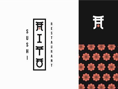
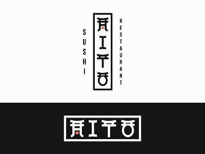
Hito is a sushi restaurant that offers traditional as well as experimentional tastes. These guys are trained professionals with a lot of years of experience behind so that they are providing high quality food with high speed and precision when serving.
Goal was to make an identity that still has that Japanese traditional vibe but also involving the latin type so it appeals to the people around the world.
We made a custom typography “Hito” with Latin letters and also using the Japanese element “Torri gate” And also the cherry blossoms as contribution to the identity system by making the emphasis on tradition and heritage.
Double tap if you enjoyed and make sure to save this post for later inspiration!


