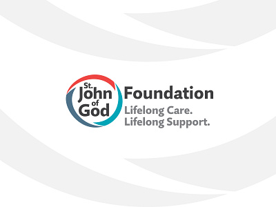
Saint John of God Foundation Logo Design
Logo design for Saint John of God Foundation, an organization supporting people with intellectual disabilities and those dealing with mental health problems. We have been working closely with the client to deliver a logo, visual identity, stationery package, and supporting elements for their new rebrand.
We distilled the pomegranate icon to a more abstract shape; the imperfect circle represents the challenges of lifelong care; the new humanist typeface is more open and approachable, the grey reduces contrast to appear more welcoming and less formal; the shapes of the three sections, in contemporary colours, represent the three key components of the service: adult & youth mental health, intellectual disability, international development.
Let's stay in touch 👋
studio@goworkhouse.com | Instagram


