Pinnet | Logo design concept


Hey there,
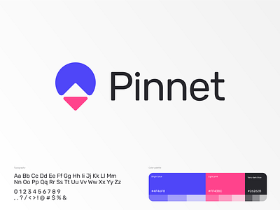
This is an updated version of the latest Pinnet logo.
In this case, I made the sign more friendly with rounded corners, brighter colors, and a thinner font.
What do you think about this concept?
Need help with a logo for your business? I would like to help you!